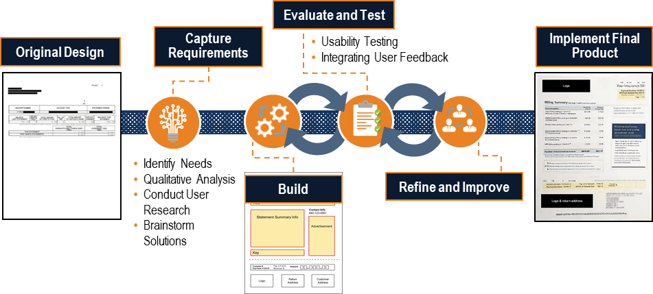
Requirements capturing was the first step taken in this project life-cycle. Identifying the needs of the client and understanding the challenges of the current design based on initial research and user feedback helped drive the focus and decisions throughout the stages of product development.
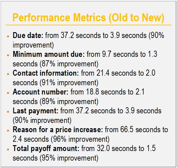
Design Baseline: Baselined the existing statement with eye-tracking/performance testing tasks such as "find total balance," "find amount due this month," and "find your account number.” These metrics were used for tracking improvement during future testing.
Current Needs: In talking with the client, all enterprise products such as bank, insurance, and investments, needed to be included in the design and presented in a simplistic way. The new design also needed to be suitable for display on desktops, laptops, tablets, and mobile phones.
Qualitative Analysis: This included end user interviews and surveys based on the old design to identify current problems that needed remediation.
User Definition/Design: Participant feedback was gathered to identify important aspects of the new design:
o Data element prominence ‘front and center’
o Wording: e.g. – Payment Summary to Policy Summary
o Put summary information in chronological order
o Add descriptive line items
o Enlarging font sizes of important data elements for readability: e.g. – due date, customer number, minimum due, advertisement
o Include a statement that says there is ‘more information on the back of this page’
o Present credits before the minimum amount due
o Add the account number

The designer and engineering team took information learned from the requirements capturing exercises and created frameworks for the new design. These templates were targeted around the sections of the statement where participants struggled the most. The designer gathered qualitative feedback to gauge users' level of satisfaction and to uncover any unexpected experience improvement opportunities. These drafts were created and continuously modified based on: heuristic evaluation, eye tracking, and participatory design.
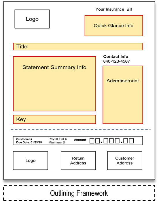
Heuristic Evaluation: Used as a guideline during prototyping and for identifying usability problems in the user interface design
Mail Sort: This exercise gave the project team insight into how customers interact with their mail—from pulling it out of the mailbox to opening the statement we were redesigning—which proved hypothesis about advertisement interaction and even showed customers who had used the statement for 30 years still had trouble finding what they needed. These data framed the new design prototypes.
Eye Tracking: Multiple eye tracking studies were conducted on the old and new designs. The ‘Where it was’ graphic shows where the participant would find the data they were looking for (the task), the center graphic shows what they saw in the unshaded areas (anything shaded they either did not see, or was just a saccade—a rapid eye movement between fixation points), with the reverse image on the right, showing all of the data they missed while searching for a single bit of data.
Retrospective Think Aloud (RTA): Technique used to review where the participant looked, then ask why they looked in that movement pattern. When participants see their gaze pattern, and explain why they looked in spot 1 then spot 2 then spot 3, and multiple participants follow the same pattern, it gives the business an idea of how customers quickly scan the page looking for the information, and identifies better locations for certain data elements.
Participatory Design: Actively involves the end users in the design process to make sure needs are met and the product is usable. For example, participants were asked to design their own statement, based on templates the designer and team came up with as another means of evaluation.
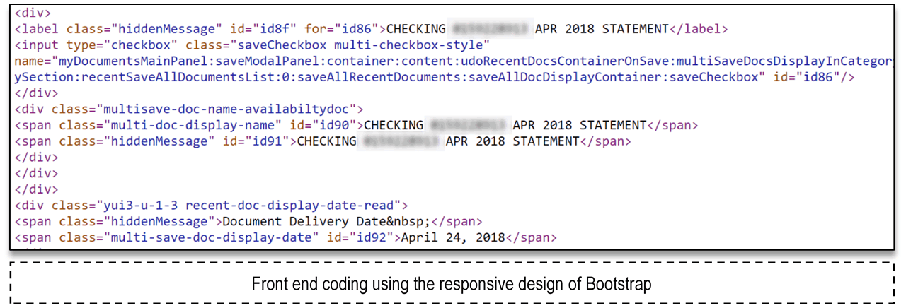
The eye tracking, RTA, and participatory design techniques were iterated as need through final development. The front-end of the mobile version of the statement using Bootstrap (responsive design).

Bootstrap was used to create the digital version of the statement.
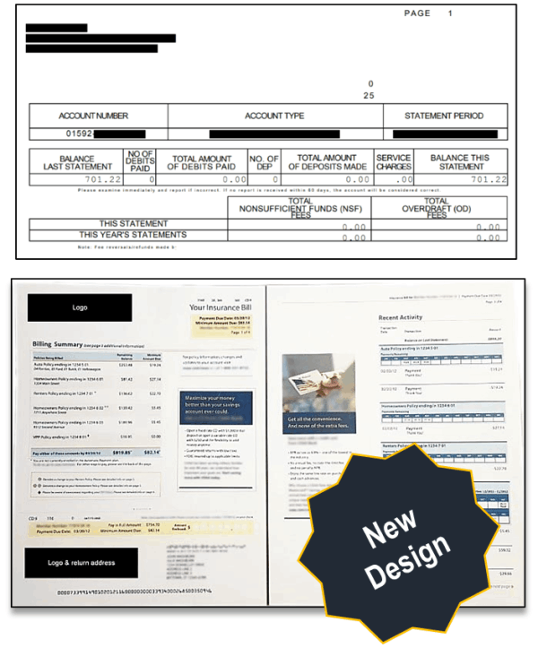
Based on results from testing and evaluation of each prototype, improvements were made on design layout as well as design aspects like font sizes, color contrast, and conversational text. After these improvements, eye-tracking testing was used again to compare older drafts to the updated design.

When comparing the original statement to the newest, the new design was preferred 100% based on usefulness, efficiency, effectiveness, learnability, and satisfaction. Participants did not find it difficult to find the information they needed and even noticed the embedded ads that were usually ignored in the original statement.

The company needed to consolidate mulitiple, outdated call center applications into a single, modernized system which would allow a single customer service representative to service all concerns a customer called about.
The company wanted to improve the mortgage prequalification flow by cutting the process down to the bare minimum needed for a prequalification letter, as most realtors require buyers to be prequalified before they will show a house.