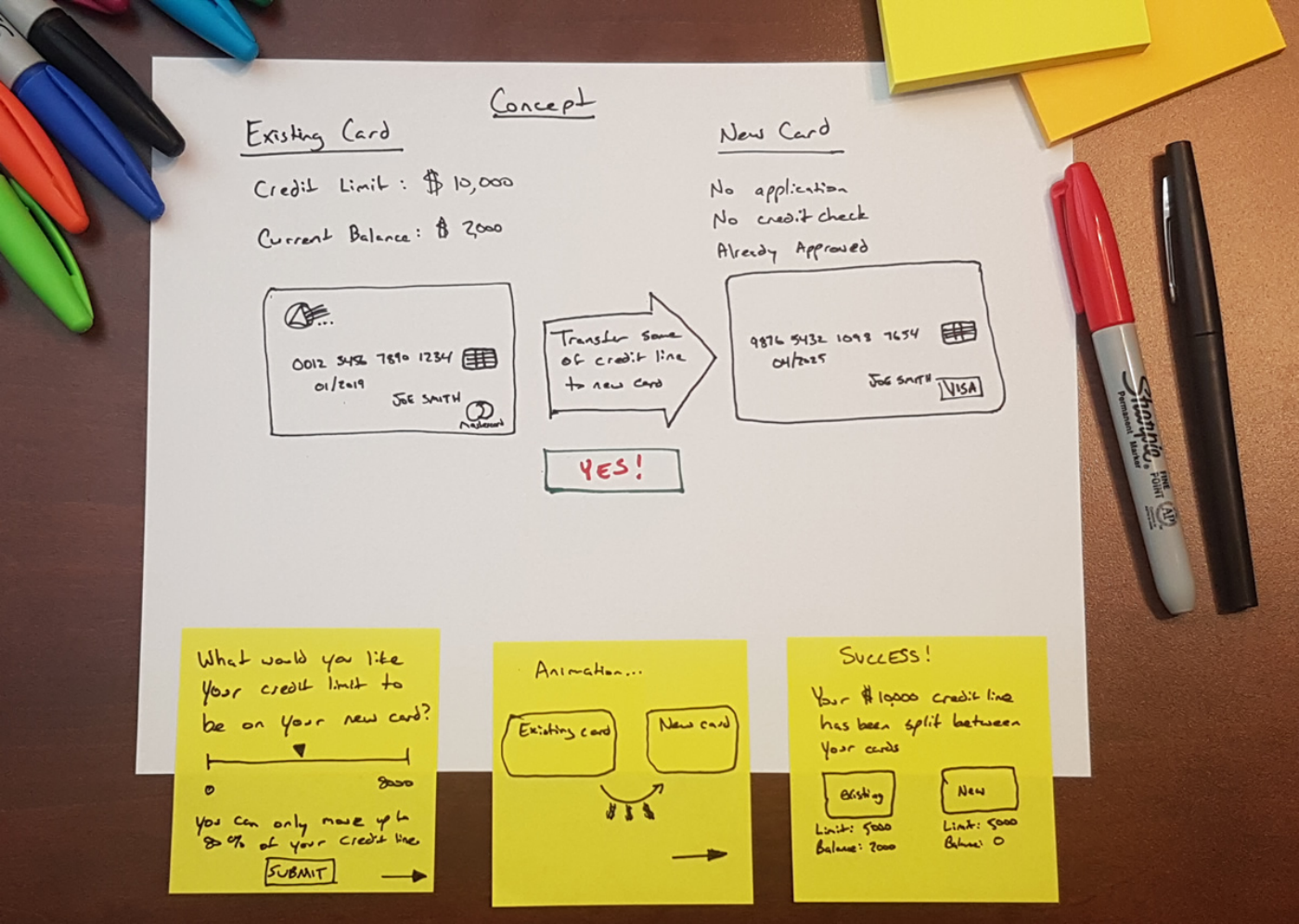
Find a way to help customers with new credit card products that avoid credit applications, credit score impacts, and credit line increases.
The concept from the business stakeholders was relatively understandable for someone who was very credit savvy, but not for the general public. The risk of reallocating a portion of a customer's credit line to another card was a confusing concept. Even after reading about the idea, usability participants were still unclear how it worked, and how they should go about responsibly allocating the credit limits and using the cards. Another challenge with the project team was pushback on bringing users in for qualitative feedback sessions.
Product Owners, Project Management, UI Designers, UI Producers, and Legal Teams
This project received multiple rounds of testing that targeted customers with a single existing credit card and customers with multiple existing credit cards. After concepting, I set up the InVision prototype from the UI producers and designers in UserTesting.
Methods:
• Remote unmoderated feedback sessions using UserTesting
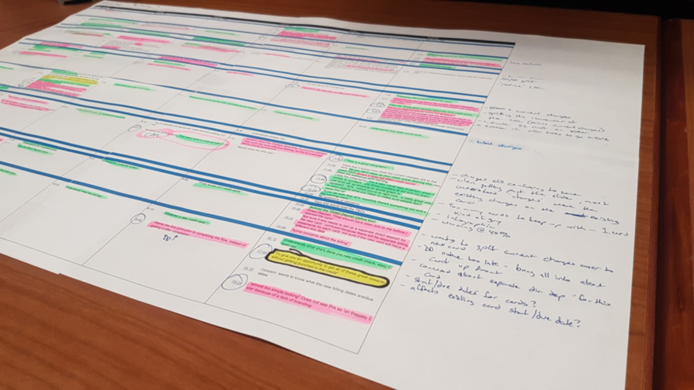
• Post UserTesting Analysis and Recommendations
Some of the things we learned:
The concept was very confusing for people not financially savvy. Even though they read, and repeated back, "no credit check", they said their credit would be hit with an inquiry. Participants who were on top of their credit seemed to understand the basic concept; however, they did not find value if they liked their existing card better.


We were successful in learning this was not a good approach to deepen the relationship with the customer. The concept was very confusing for most participants. For example, a participant noticing the alert about keeping the card balance below 40% to avoid negatively impacting her credit score still said she would put half of her existing credit line on the second card to use on vacation, thinking it would keep her from over spending. She mentioned using the full available balance, but did not understand being at 100% of the card limit would negatively impact her credit score. The concept was scrapped as it was a brand risk that could put customers in a worse financial position.
The company wanted to update a boring, difficult to understand black-and-white statement that caused a lot of calls, to a modern, easy to read and understandable format. This format would also be converted to PDF for viewing online.
This is a dual-facing experience for customers and internal customer service representatives. The company wanted to improve the mortgage prequalification flow by cutting down to the bare minimum needed for a prequalification letter, as most realtors require buyers to be prequalified before they will show a house.